...
Creative Web Design Planning

How to Achieve Perfect Color Harmony

Colors play a crucial role in web design. They can evoke emotions, communicate a brand’s personality, and guide users through a website’s content. Choosing the right color scheme is essential to create an effective design that resonates with your audience. One of the most popular methods for achieving color harmony is the 60-30-10 color rule.

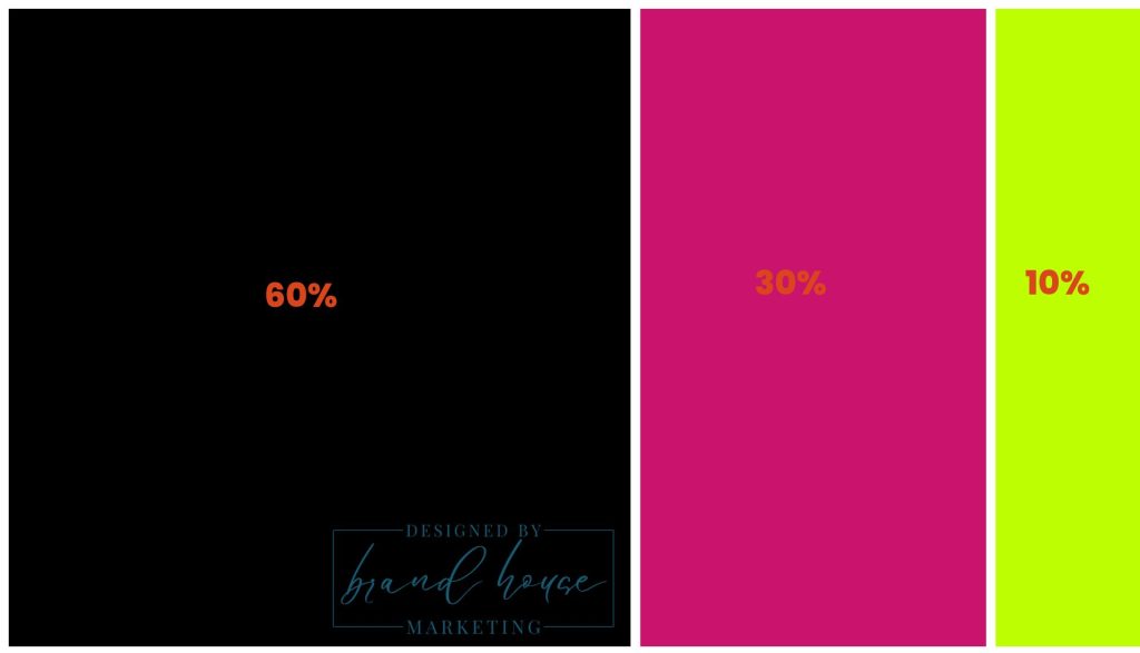
The 60-30-10 rule is a simple and effective way to create a balanced color palette. The rule is based on the idea that a color scheme should consist of three main colors, with one color dominating and the other two complementing it. Here’s how it works:
  • 60% of the design should be the dominant color
  • 30% of the design should be a secondary color
  • 10% of the design should be an accent color
60-30-10 web color
Let’s dive deeper into each of these colors and their roles in web design.

The Dominant Color

The dominant color is the primary color in the design. It sets the overall tone and mood of the website and is usually the most prominent color. The dominant color should reflect your brand’s personality and message. For example, if you’re designing a website for a luxury brand, you may want to use a dominant color that exudes elegance and sophistication, like deep purple or navy blue. On the other hand, if you’re designing a website for a fun and playful brand, you may want to use a dominant color that’s bright and cheerful, like yellow or orange.

The Secondary Color

The secondary color is used to support the dominant color and add depth and contrast to the design. It should be used in a way that doesn’t overpower the dominant color but rather complements it. The secondary color can be a hue of the dominant color or a contrasting color that creates visual interest. For example, if your dominant color is blue, you might use a secondary color like teal or green to create a pleasing color scheme.

The Accent Color

The accent color is the pop of color that adds visual interest and draws the user’s attention to specific elements of the design, such as buttons or links. It’s usually a bright, contrasting color that stands out from the other colors in the design. The accent color should be used sparingly to prevent it from overwhelming the other colors in the design.

In conclusion, the 60-30-10 color rule is a straightforward and effective way to create a well-balanced color scheme for your web design projects. By following this rule, you can create a harmonious design that resonates with your audience and effectively communicates your brand’s message.

Why Your Employees Are Your Best Marketers

Discover why employee-generated content (EGC) is the future of marketing. Explore strategies to empower your team as authentic brand ambassadors and unlock the benefits of trust, engagement, and cost-effective growth.

Read More »
Scroll to Top
Seraphinite AcceleratorOptimized by Seraphinite Accelerator
Turns on site high speed to be attractive for people and search engines.